Combining Flutter's AnimatedList with MobX
In my previous post, I demonstrated how MobX is a great library for doing state management with Flutter applications (at least I hope I did!). It's quite common for applications to present...

UPDATE 24/6/2019: A bug was originally found that I submitted PR for into the MobX repository that has been merged in and released. This blog post and the code has been updated since it's been originally written to make use of that fix
In my previous post, I demonstrated how MobX is a great library for doing state management with Flutter applications (at least I hope I did!). It's quite common for applications to present a list of items to the user and animating these lists can help your app to life. Fortunately, Flutter has the AnimatedList widget that can help us achieve that goal and I'll be demonstrating how we can make use of it along with MobX. Note that I'll be skipping the parts around installing MobX and how to use code generation. I'll also be assuming that readers have a basic understanding of MobX's core concepts covered here and in my previous post. The complete sample is hosted in this GitHub repository
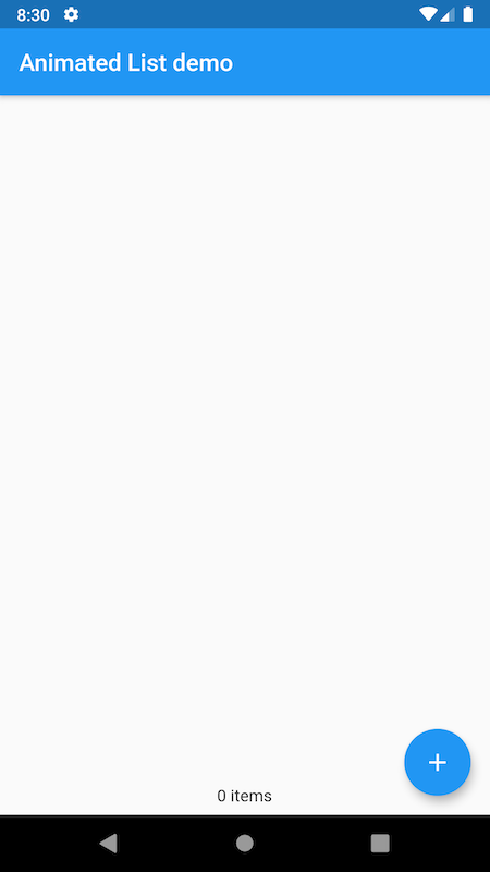
The above screenshot shows what the initial state of our sample app looks like. The floating action button will allow us to add new items and there is text on the bottom to help keep track of the total number of items. As an item is added, it should slide in from the right and the total down the bottom should be updated.
Let's first define what the model of the item will look like
class Item {
  final DateTime dateAdded;

  Item(this.dateAdded);
}
Here, each item is expected to contain date and time information on when it was added. An item is represented by the ItemCard widget
import 'package:flutter/material.dart';
import 'package:provider/provider.dart';
import '../models/item.dart';
import '../stores/data_store.dart';

/// Used for rendering each item in the list.
/// Displays information on when each item was added along with a remove button.
class ItemCard extends StatelessWidget {
  final Item _item;
  final bool _removable;

  const ItemCard(this._item, this._removable, {Key key}) : super(key: key);

  @override
  Widget build(BuildContext context) {
    return Padding(
      padding: const EdgeInsets.all(8.0),
      child: Row(
        children: [
          Expanded(
              child:
                  Text('Item added at ${_item.dateAdded.toIso8601String()}')),
          RaisedButton(
              child: Text('Remove'),
              onPressed: _removable
                  ? () {
                      Provider.of<DataStore>(context).removeItem(_item);
                    }
                  : null),
        ],
      ),
    );
  }
}
This is fairly straightforward, it displays the date and time the item was added and has a button that allows the user to remove the item. Which is an action exposed via the DataStore class that will hold the list of items
import 'package:mobx/mobx.dart';
import '../models/item.dart';

part 'data_store.g.dart';

class DataStore = _DataStore with _$DataStore;

abstract class _DataStore with Store {
  @observable
  ObservableList<Item> items = ObservableList<Item>();

  @computed
  String get itemsFooter =>
      "${items.length} ${(items.length == 1) ? 'item' : 'items'}";

  @action
  void addItem() {
    items.add(Item(DateTime.now().toUtc()));
  }

  @action
  void removeItem(Item item) {
    items.remove(item);
  }
}
This store maintains the list of items we need to display through the items property. This is an ObservableList so that we can be notified on when the list has been modified. This happens through two methods that are treated as MobX actions. One is for adding an item addItem and the other for removing a specific item through the removeItem method. Note that we have also defined the footer itemsFooter to be will displayed at the bottom the of the page. If there is one item, it should the text to be displayed should be"1 item" and in all other case it will be "x items" where x is the total number of items. By defining it as a computed observable, modifications to the items property will make sure that itemsFooter is kept in sync.
This store is connected with the DataPage class as shown below
import 'package:flutter/material.dart';
import 'package:flutter_mobx/flutter_mobx.dart';
import '../widgets/item_card.dart';
import '../stores/data_store.dart';

class DataPage extends StatefulWidget {
  final DataStore store;
  DataPage(this.store, {Key key}) : super(key: key);

  @override
  _DataPageState createState() => _DataPageState();
}

class _DataPageState extends State<DataPage> {
  final GlobalKey<AnimatedListState> _listKey = GlobalKey<AnimatedListState>();
  // This tween with the slide transition will cause the item to slide from right to left into the list
  final Tween<Offset> _tween = Tween<Offset>(
    begin: Offset(1.0, 0.0),
    end: Offset.zero,
  );

  @override
  void initState() {
    super.initState();
    widget.store.items.observe((listChange) {
      if (listChange.added?.isNotEmpty ?? false) {
        // an item has been added, synchronise the items displayed within the AnimatedList with the items within an our store
        _listKey.currentState.insertItem(listChange.index);
      }
      if (listChange.removed?.isNotEmpty ?? false) {
        // an item has been removed, synchronise the items displayed within the AnimatedList with the items within an our store.
        // note that when removing the AnimatedList will play the animation in reverse (left to right) for us so can reuse the
        // same tween for adding in items
        _listKey.currentState.removeItem(
            listChange.index,
            (context, animation) => SlideTransition(
                  position: animation.drive(_tween),
                  child: ItemCard(listChange.removed.first, false),
                ));
      }
    });
  }

  @override
  Widget build(BuildContext context) {
    return Scaffold(
      appBar: AppBar(
        title: Text('Animated List demo'),
      ),
      body: Column(children: [
        Expanded(
          child: AnimatedList(
            key: _listKey,
            initialItemCount: 0,
            itemBuilder: (context, index, animation) => SlideTransition(
                  position: animation.drive(_tween),
                  child: ItemCard(widget.store.items[index], true),
                ),
          ),
        ),
        Padding(
          padding: EdgeInsets.fromLTRB(0.0, 0.0, 0.0, 8.0),
          child: Observer(
            builder: (_) => Text('${widget.store.items.length} items(s)'),
          ),
        ),
      ]),
      floatingActionButton: FloatingActionButton(
        onPressed: () {
          widget.store.addItem();
        },
        child: Icon(Icons.add),
      ),
    );
  }
}
The DataPage is a StatefulWidget that takes an instance of the DataStore class (not shown here but I've passed it using the provider package) and is associated with the _DataPageState class. Together, they are responsible for displaying our list of items as per the screenshot above. If we look at the build method that is responsible for rendering, we notice a FloatingActionButton that will cause items to be added, an AnimatedList and aText widget. The latter is responsible for display the total amount of items in the list at the bottom of the screen. It has the Observer widget as parent so that it can be notified of when the items have been modified so that the total can be updated on-screen.
The AnimatedList is responsible for rendering the list of items. It starts off being an empty list, hence the initialItemCount is set to zero. The itemBuilder property defines how we want to render each item and will pass to us an Animation<double> object (I've named it animation) that represents our animation and ots value will go from zero to one. To indicate that we want the item represented by the ItemCard widget (more on this later) to slide in, we wrap it with the SlideTransition widget. The SlideTransition widget has a position property that defines the animation that controls the position of its child (the ItemCard widget). This requires an Animation<Offset> value that we can obtain by chaining the animation object passed by the AnimatedList's itemBuilder with a Tween<Offset> object that we've named as _tween in the _DataPageState class. This tween is responsible for the defining beginning and end Offset values, which determines the beginning and end position of the ItemCard as it slides in. The Offset constructor has two arguments, the first represents the horizontal component whilst the second is the vertical component. By passing Offset(1.0, 0.0) as the beginning and Offset.zero as the end of our tween, this will enable the animation to slide the ItemCard from right to left as it'll start horizontally off-screen.
To actually insert and remove items from the AnimatedList widget and have animations occur though, we need to make use of the AnimatedListState class. Following the advice from the API docs, we have created a GlobalKey<AnimatedListState> object that is passed as the key of our AnimatedList to associated them with each other. Note that the API docs for AnimatedListState also state that its insertItem method is what's used to insert an item into an AnimatedList with an animation. Items can be removed using the removeItem method. Given that the modification of our items is done via the DataStore class, the question then is how we can invoke the AnimatedListState's insertItem or removeItem as an item is added based on if the DataStore's addItem() method or removeItem has been invoked. Fortunately, as we have the items property an ObservableList, MobX provides a way for us to observe when our list of items has been changed. We configure this within the initState method shown again below for convenience
@override
  void initState() {
    super.initState();
    widget.store.items.observe((listChange) {
      if (listChange.added?.isNotEmpty ?? false) {
        // an item has been added, synchronise the items displayed within the AnimatedList with the items within an our store
        _listKey.currentState.insertItem(listChange.index - 1);
      }
      if (listChange.removed?.isNotEmpty ?? false) {
        // an item has been removed, synchronise the items displayed within the AnimatedList with the items within an our store.
        // note that when removing the AnimatedList will play the animation in reverse (left to right) for us so can reuse the
        // same tween for adding in items
        _listKey.currentState.removeItem(
            listChange.index,
            (context, animation) => SlideTransition(
                  position: animation.drive(_tween),
                  child: ItemCard(listChange.removed.first, false),
                ));
      }
    });
  }
We make use of the observe method exposed by the ObservableList class. This callback is invoked when the list has been modified. It passes a ListChange object that allows us to know if items had been added or removed, and the index of the item that has been added/removed. This is the point where we can invoke the insertItem/ removeItem method exposed by the AnimatedListState. When removing an item via the AnimatedListState's removeItem method, note that it allows us to define the appearance and animation of the item being removed. This is where we can disable any kind of user interaction with the item being removed since it'll remain visible while the removal animation is occurring. The animation in this case will play the animation used to slide the animation in, but in reverse. In other words, the item will slide from left to right (off-screen). Now let's see it all in action

The items slide in and out when added or removed, and we can see the text showing the total items at the bottom updates. Feel free to check the repository for a closer a look if you want to play around with. The Flutter team also has a brief video on the AnimatedList as part of their widget of the week series
If you need your lists to be more lively, consider using the AnimatedList widget in your apps. It might just be the thing your app needs to give it a little extra oomph.